New Feature: Not How Hot It Was, But When
obseed now breaks your session into five-minute slices and shows the temperature curve instead of a single average, with a heat load reading per slice and honest gaps wherever the data does not reach.

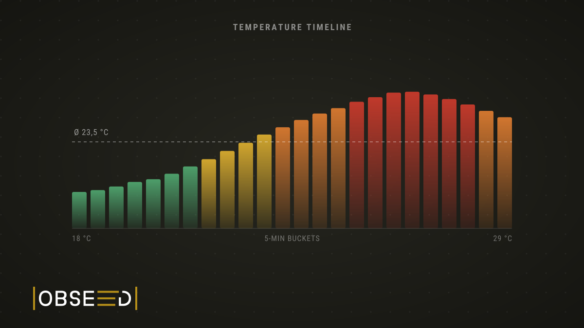
Two sessions, same line in the log: 23.5 °C average. One was a pleasant run through the woods. The other took you apart over the last five kilometres. In hindsight they look identical.
From today obseed no longer tells you only how warm it was on average, but when it was warm. Every session with GPS gets broken into five-minute slices, and each slice carries its own temperature and its own heat load.
Why Heat Costs More Than the Numbers Admit
For your circulation, warmth is not a comfort question. It is a second job. Your body has to supply the working muscles with blood and shed heat through the skin at the same time, and both draw on the same circulation. You know the result from every summer run: your heart rate creeps upward while your pace stays exactly where it was. That upward creep is cardiac drift.
Then there is fluid. You sweat more, plasma volume drops, and each beat moves less blood than it did an hour ago. Your heart makes up the difference with frequency. You still pay for it.
None of this scales evenly. Most people barely notice the step from 18 to 22 degrees. The step from 28 to 32 decides whether your long run stays a long run. That upper range is exactly where an average is worth the least, because it irons flat the peaks that actually mattered.
An Average Makes a Poor Witness
Picture a two-hour ride. You start at seven, still in the shade of the valley, 18 degrees. An hour later you are up top with the sun full on you, 29 degrees. What your session recorded until now was 23.5 degrees. Arithmetically flawless and completely useless, because that number describes a moment which never happened that morning.
What matters is the spread. Once you can see that the second hour ran eleven degrees warmer than the first, the way you fell apart at kilometre 45 finally makes sense. And only then can you do something differently next time: start earlier, plan the bottles around the exposed section, take the pace down before the climb rather than after it.
Five Minutes to a Bar
The session view has a new card. It shows one bar per five-minute slice, plus the session average, minimum and maximum. Hover a bar and you get the time window, the temperature, the heat load and how well that slice was covered by your data.
The interesting part is where those values come from. Weather services publish hourly figures for a coarse grid, while you move minute by minute and travel across that grid. So obseed works backwards through your trackpoints. For each slice it establishes which grid cell you were actually in and for how long, interpolates the hourly figures onto the time in between, then weights everything by how long you spent where. Two coarse inputs turn into a curve that follows your movement instead of the regional forecast.
Four Bands Instead of a Bare Number
Temperature on its own says little. Thirty degrees in dry mountain air and thirty degrees in heavy humidity are two entirely different days, and your circulation knows that better than your thermometer does. Each slice therefore also carries a heat load score from 0 to 100 that weighs temperature and humidity together. It follows the established WBGT index and the flag thresholds published by the American College of Sports Medicine.
You do not need to memorise the number. The chart carries it as colour, in four bands:
- Safe (up to 25). Heat is not a factor in this session.
- Caution (25 to 50). Noticeable. Worth a look at pacing and hydration.
- High (50 to 85). Conditions are now shaping how the session ends. Hard intensities here are a deliberate choice, not an afterthought.
- Stop (above 85). The range where hard efforts carry a genuine health risk.
Because the colour sits on the bar itself, you can see at a glance whether your interval block happened to land in the orange window. It usually was not chance.
What the Timeline Deliberately Refuses to Do
A feature is also worth what it leaves out. Three limits we built in on purpose:
No GPS, no timeline. The whole thing hangs on your trackpoints. For an indoor session, or any recording without position data, the card simply does not appear rather than drawing a flat line that pretends to know something.
Gaps stay gaps. A slice only reports a temperature when your trackpoints cover at least 80 percent of it. Twenty seconds of data across five minutes is not a measurement, it is a guess. Those slices stay empty and report their coverage openly. A missing value does not mean “conditions were harmless”. It means we do not know.
Fresh data is allowed to change. Providers revise historical weather after the fact, and not by a rounding error. For one run during testing, the same-day request returned 26.9 degrees while the next-day request returned 32.45 degrees for the same hour. Five and a half degrees is not a difference you can wave away. obseed therefore marks recent sessions as provisional, refetches them automatically after six days, and only then calls the values final. Sessions already sitting in your account get recalculated from the weather data we already stored, without a single new request to the provider.
Look at the Shape, Not the Average
If you have trained in the heat these past few weeks, the most interesting session is probably already in your account. Open the long run that felt harder than it looked on paper, and look at the shape of the curve. There is a fair chance you have been blaming your form for something the weather did.
Read Next
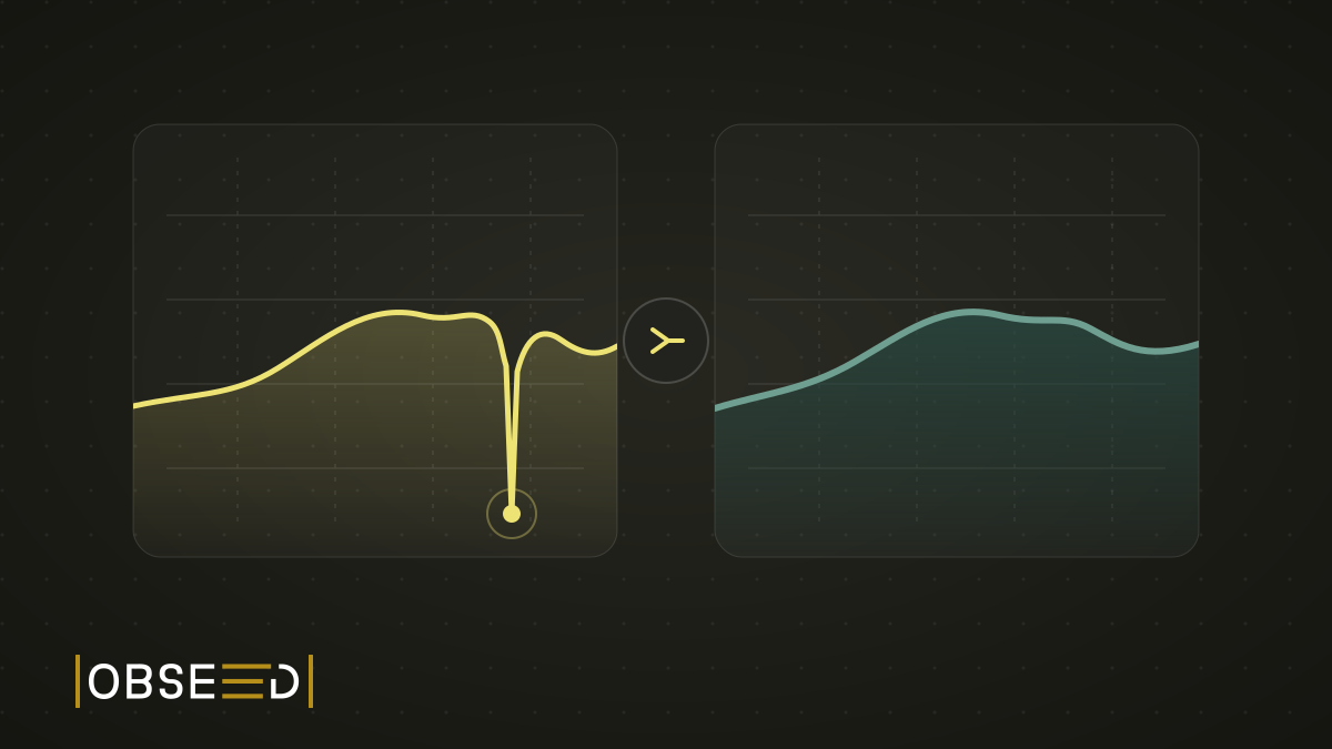
New Feature: The Mountain That Never Happened
My watch went for a swim in a fountain and invented roughly 100 metres of climbing. obseed now corrects errors like this automatically, including in your old sessions.

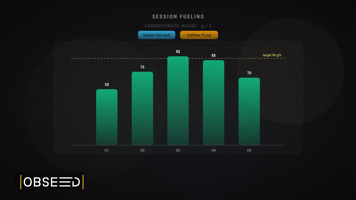
New Feature: Log the Fuel Behind Every Session
obseed now lets you attach real sport-nutrition products to each training session — capturing the exact carbs, sodium, caffeine, and calories you took in, right next to what you burned.
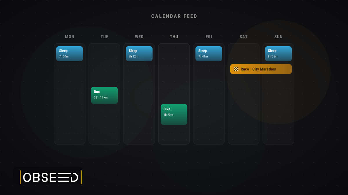
New Feature: Your Training and Sleep, Now in Your Calendar
obseed now offers a personal iCalendar feed — subscribe once to see your sport sessions, competitions, and sleep in Apple Calendar, Google Calendar, or Outlook.