Weekly and Monthly Views: See the Pattern in Your Tags
Your daily tags now become visual heatmaps. obseed weekly and monthly views reveal supplement gaps, sickness arcs, and caffeine rhythms at a glance.


Scroll through Instagram or TikTok for five minutes and you’ll find them: hand-drawn habit grids. Caffeine intake, supplement schedules, mood logs, sleep quality, all tracked with colored pens on paper. The most popular spreads? Habit trackers. Colored squares on a monthly grid. We thought: why draw this by hand when your daily tags already contain all this data?
Today, we’re releasing weekly and monthly tag summaries, visual heatmaps that turn your daily journaling into patterns you can read at a glance.
From Daily Journaling to Visual Patterns
Every time you tag something in obseed, a supplement, a symptom, a coffee, a sauna session, that’s a journal entry. Until now, each day stood on its own. The new weekly and monthly views zoom out on that daily journaling habit and show you what individual entries can’t: patterns.
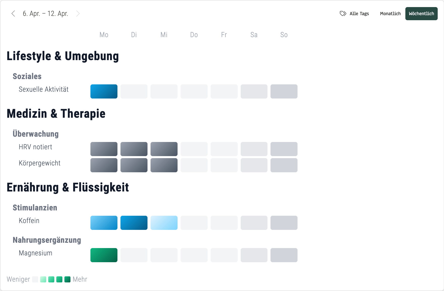
Weekly view (April 6–12, 2026): Caffeine Monday through Wednesday, magnesium only on Monday, HRV and weight tracked consistently. Gaps and rhythms become visible in seconds.
The weekly view shows Mon–Sun in columns, grouped by category. Color intensity maps to frequency: the more entries, the deeper the color. You see supplement gaps, caffeine rhythms, and recovery routines without scrolling through seven individual days.
What we noticed ourselves: a missing green cell in a row of green cells is impossible to ignore. You don’t need analytics to see that you skipped your supplement on Wednesday. The weekly view makes compliance visible, not calculated.
The monthly view expands to 31 columns. This is where things get interesting.
A Cold You Can See
Last month, I got sick. It started around day 23 with a cough. Then sore throat, body aches, headaches. Looking at my March 2026 monthly view, the whole episode tells itself:
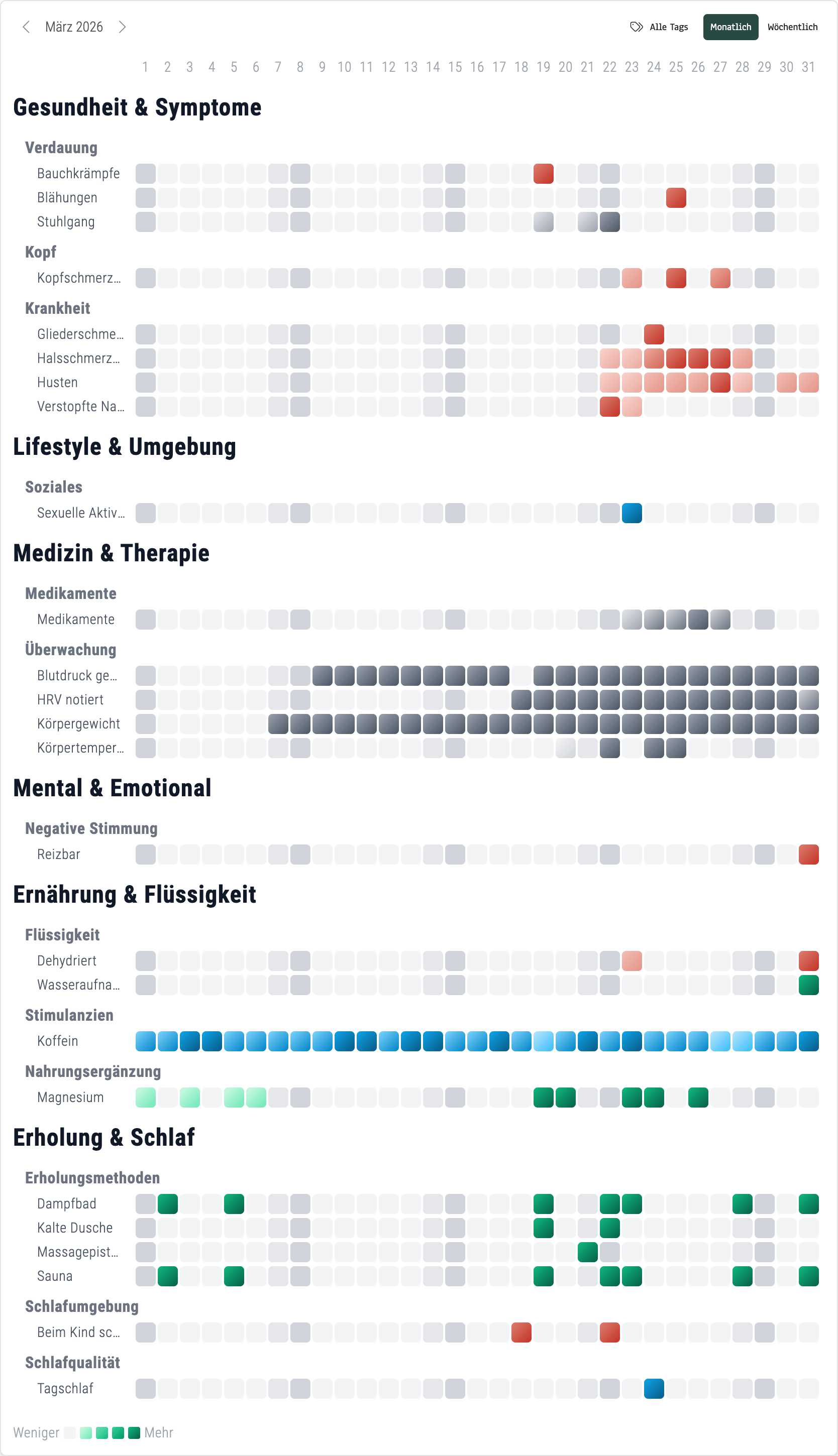
Monthly view March 2026, real data: Three weeks of steady routine, then the cold hits on day 23. Red symptom clusters, medication entries, and temperature monitoring all visible in one grid.
Three weeks of steady caffeine (blue), supplements (green), and monitoring (gray). Then red cells appear. Symptoms cluster and deepen. Medication lights up. Temperature monitoring starts. By month’s end, the red fades and routine returns.
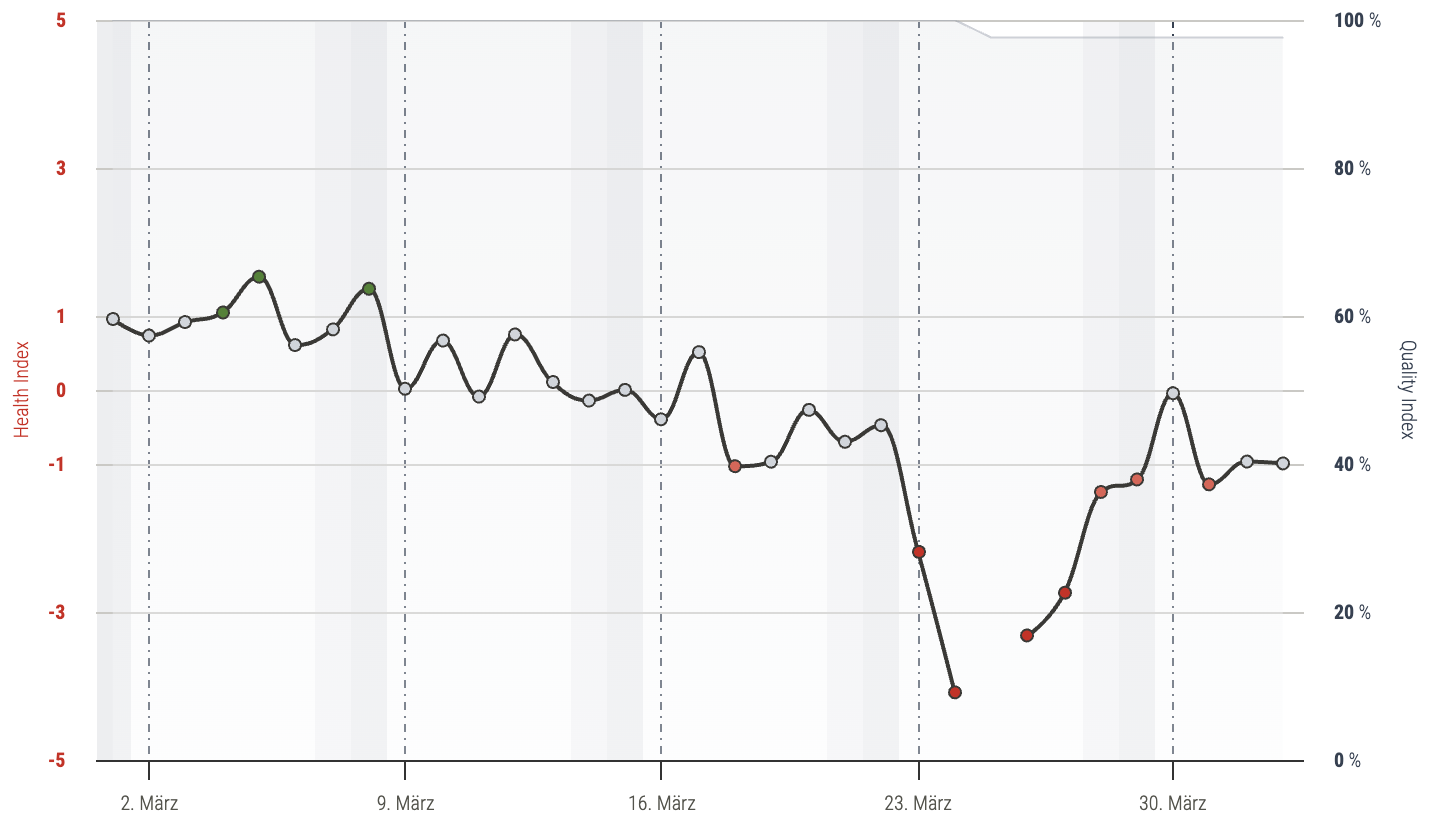
Health Index March 2026: The dip starting on day 23 is clearly visible. The wearable data already detected it.
The Health Index had already flagged something on day 22. The wearable data alone reveals a lot. But the heatmap with tag context tells the full story: which symptoms appeared, when medication started, and how recovery unfolded step by step.
What Patterns Will You Discover?
The sickness arc is one example. But the weekly and monthly views reveal other patterns too:
Supplement Consistency
Are you taking magnesium every day, or forgetting on weekends? The gap is one glance away. No scrolling, no counting. A missing green cell tells the story.
Caffeine and Sleep
Five dark blue cells Monday through Friday, lighter on weekends. Compare that with your Oura sleep scores and the correlation is right there. How does your sleep change in caffeine-free weeks?
Recovery Routines
Sauna twice a week, cold exposure on Thursdays. The rhythm becomes visible, and you can see whether it holds up during busy weeks. Consistency is key, and the grid shows it honestly.
Around 70% of health app users abandon within the first 100 days (JMIR, 2024). A key reason: data that doesn’t feel tangible. These views make your tracking habit visible, and that’s what keeps it alive.
Weekly View vs. Monthly View
| Weekly View | Monthly View | |
|---|---|---|
| Time span | Mon–Sun (7 days) | 1–31 (full month) |
| Strength | Spot weekly routines | See long-term arcs |
| Best for | Supplement gaps, caffeine rhythms | Sickness episodes, seasonal patterns |
| Ideal use | Weekly check-in | Monthly review |
How to Access the Views
Open your profile in obseed and navigate to the Journal section. You’ll see the daily card view you already know. In the top-right corner, toggle between Weekly and Monthly. Use the arrow buttons to navigate between time periods.
If you import Oura tags, they appear automatically alongside everything you tag manually. All connected devices, one heatmap.
Daily Tagging, Visible Patterns
Individual days are useful. But the pattern is the story. Whether it’s supplement compliance, a sickness arc, or a caffeine rhythm: the weekly and monthly views turn your daily tagging into something you understand at a glance. No drawing, no analysis. Just open and see.
Disclaimer: obseed is not a medical device. The recorded data and correlations do not replace professional medical diagnosis or treatment. Always consult a healthcare professional for health-related questions.
Frequently Asked Questions About Tag Summaries
Visual heatmap-style calendar views that aggregate your daily tag entries into color-coded grids. The weekly view shows Monday through Sunday grouped by category. The monthly view shows days 1–31 with all tag categories visible, one row per tag type, one column per day.
No. If you already tag daily in obseed or import tags from Oura, the views generate automatically. Open your profile, navigate to the Journal section, and toggle between weekly and monthly in the top-right corner.
Each tag category has its own color. Green represents supplements, blue and teal stand for caffeine and stimulants, red and orange indicate health symptoms, and dark gray marks monitoring entries like HRV or body weight. Intensity ranges from light (less) to saturated (more).
Yes. All 91 Oura tags imported into obseed appear in both views, exactly like manually created tags. Your complete tagging history is represented regardless of source.
Tags from all connected sources appear: manual entries, Oura imports, and any future device integrations. The views also sit alongside data from Garmin, Whoop, Withings, and Wahoo for the full context.
Read Next

Oura Tags in obseed: 91 Signals, Automatically Connected to Your Entire Stack
91 Oura tags flow automatically into obseed — correlating with Garmin, Whoop, Withings, and Wahoo. No double entry. No silos. Your full picture.

Beyond the Numbers: Universal Hierarchical Multi-Tagging in obseed
Your wearable measures everything — except the why. obseed Universal Tagging: 290+ tags across 10 categories, 6 time models, cross-device correlation.

Your Nervous System, Decoded: HRV Analytics in obseed
60+ HRV metrics across 9 physiological categories from your wearable. Research-grade analysis: Poincaré, DFA alpha-1, multiscale entropy, personal baseline, and 15-page reports.